This is the story about my first app that I not only designed, but went through all the steps before the App Store release.
If you are a designer without a good programming experience, then first launch of Xcode will remind you first launch of 3D editor. It is not clear how to approach or where to start. Web book Design+Code helped me a lot. It is written by a designer for designers. Author uses a bunch of Sketch with Xcode and focuses on prototyping. This confusion when looking at Xcode window will fall off after one or two chapters. At the same time, if you do not know what is so good about Sketch, – you’ll get it pretty quickly. In addition to the famous graphics export in several resolutions directly from the layout, there is another very useful feature. Coordinate systems and units up to the tracking of the text are the same as in Xcode.
Why should designer have a deal with programming? Pros quite significant:
- You’ll have a really common language with developers,
- You can prototype with unlimited possibilities,
- Small projects can be developed from sketch to appstore alone.
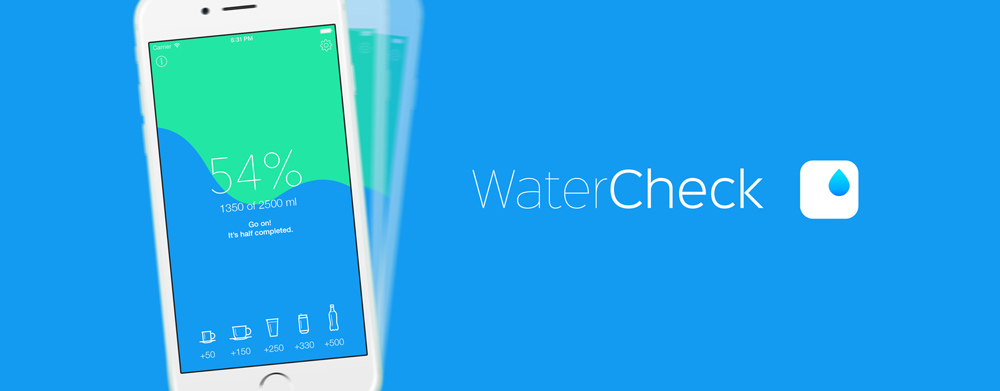
Article is just about one such project: the tracker of water intake WaterCheck.
Another water tracker
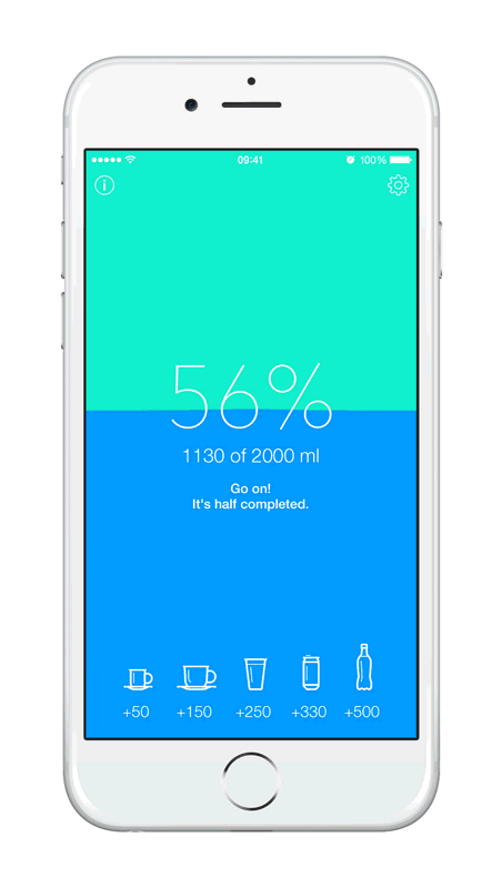
The App Store is full of water trackers with various feature-richness. Probably many of users like to consider the type of drink, although I can hardly imagine that someone sitting at the bar putted every jug of beer in the counter. I was thinking about different scenario: the laziest one. I am sure very few people would like to go through a three application screens after each cup of tea. But this does not mean that these people don’t care about their own health. Everyone who wants to live happily ever after cares about their health. WaterCheck is made for people who want to get a little healthier by cultivating one new habit - drinking their daily amount of water.
Of course, some day smart medical gadgets will assume the balance of substances in the body by themselves. But if you stay within the iOS app, the laziest scenario requires following:
- User should not do more than one tap to “drink” something.
- Ideally, he should not run the app every time.
- The app must regularly remind user to drink.
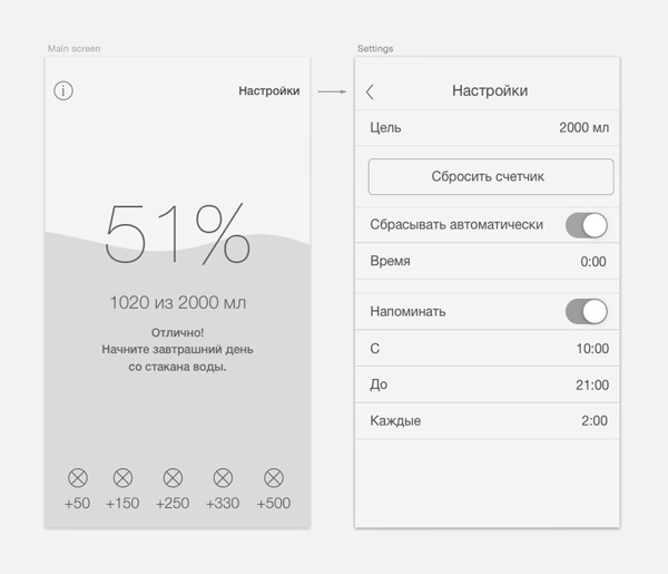
- User must have a possibility to adjust daily goal, the interval between notifications and automatic reset of the counter.
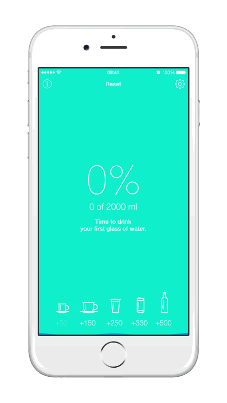
Everything is very simple. To add water in one tap, you need to take several popular volumes and make them as separate buttons on the main screen. I think, there is no point to deeply analyse such UI design.
But one thing is missing: it’s terribly boring. Drank water - input, drank water - input, drank water - input. My lazy user will get tired of this at the first day.
Lively water
All kind of pre-rendered animations are not suitable here. I need a living water, not annoying. Water should react to the movement device to make the app a little playful. So I need a bit of physics. The first thing that comes to mind is particles. Many particles interacting with each other. But the disadvantages are obvious at once: for such water to look well, app would have to take a lot of resources. This is quite reasonable in games and impermissible for an application that counts two numbers.
Interesting implementation were here
The relevant idea is about springs: to simulate a two-dimensional slice of the water surface, it can be interpreted as a set of vertical springs.
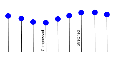
In my case, the source of external force is the device's accelerometer and taps on the input buttons. The vertical axis of accelerometer is the actual power. It is distributed on the springs depending on the horizontal axis. Then I make UIBezierPath along the array of springs. It turns funny effect. Though it’s far from realistic, but the problem is completely solved.
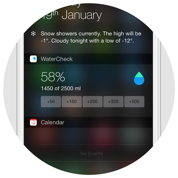
Do not run the application
iOS 8 comes with Today-widgets. Apple recommends to put here the actual data and the simple actions. This is just my case. The same five buttons and two lines of information. And the problem "do not start app every time" is solved.
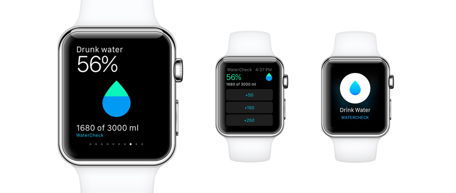
But there is much better place for the controller than Today panel. Apple announced watch. The problem "do not run the app" evolved into "do not take the phone"
Do not take the phone
Current capabilities of building the UI of Apple Watch app are similar to Tetris. Almost everything is hardly limited. But so far there is no device - there is no way to test app well enough. So it’s reasonable to keep to standard elements. Besides, I need five buttons and two text lines again.
Icon
Many were surprised to know that among the very many fields about nutrition in HealthKit there is nothing about water. Perhaps it has a good reason, but I prefer to use this.
Now WaterCheck looks like part of Apple Health. (Author of icon - my colleague Vadim Matveev)
The support
Epic fail:
One day, experimenting with the price of the app, we received several thousand units from the US. Next we get a decent bunch of negative reviews for one reason: I forgot about the ounces support.
For many users hard-coded standard volumes are not enough. But for me is important to keep the interface as simple as possible. Solution is gestures. The value can be added precisely by pulling any button up.
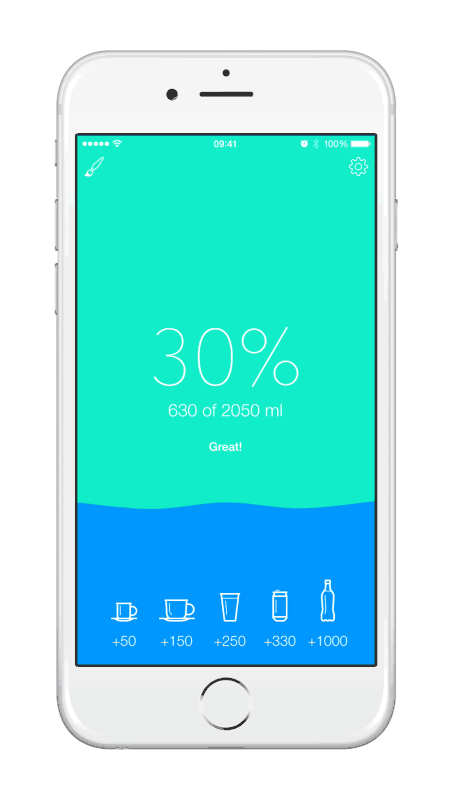
Of course, this method increases the possibility of accidental or erroneous action, so there must be a way undo. According to Apple guidelines the standard gesture for undo is to shake the device. So I did it that way.
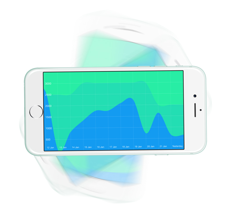
For owners of non-standard cups and glasses I made an ability to setup the values for the input buttons. In the latest updates app started to collect history and display it as a graph. It appears when the screen is rotated horizontally.
In the next article I will write about marketing WaterCheck, about good and bad moves promotion applications.